The projections of recipes on Cheffrey’s recipe selection screen are transparent projections.
Transparent Displays (p. 51)
The screens for Cheffrey are transparent displays projected onto the wall.
File Management Systems (p. 58)
Cheffrey has an option to save recipes that the user makes, and uses a file management system to organize these recipes.
Motion Graphics (p. 62)
Various screens on Cheffrey’s interface have secondary animations and motions.
Chapter 4: Volumetric Projection
The recipe selection projections for Cheffrey are made up of volumetric projections which display plates of food for the user.
Chapter 5: Gesture
Turn to Rotate (p. 98)
To scroll through recipes using Cheffrey, users must scroll through rotating volumetric projections of plates.
Chapter 6: Sonic Interfaces
Voice Interfaces (p. 115)
Cheffrey uses both visual and sonic elements to display information to users.
Cheffrey uses elements of Limited-Command Voice Interfaces (p. 118) and Conversational Voice Interfaces (p. 120). The user uses a slightly more limited vocabulary when talking to Cheffrey, but Cheffrey has a conversational element to it as well as to not feel so robotic and stiff.
Chapter 8: Augmented Reality
Context Awareness (p. 165)
Cheffrey’s system is aware of the users around it and the available ingredients inside of the house. Cheffrey uses motion activation to sense users, and scanning technology to recognize food.
In class, we received feedback on our two UI animations from other teams as well as Pannafino.
Add emphasis to plate in front
Brackets, something like that
Opacity varying
Add secondary animations
Show area of stove subtley
Easy ease the rotation
Scan goes down, maybe have some kind of imprint or visual feedback
Tone down the blue in the projections
See link Tim sent
We spent the reminder of class laying out a game plan for the next couple of days, including writing out a script for the voice of Cheffrey and figuring out what all still needs filmed.
We met up on Wednesday and worked on filming our final scenes, and spent the remainder of Wednesday night and all of Thursday working on putting our video together.
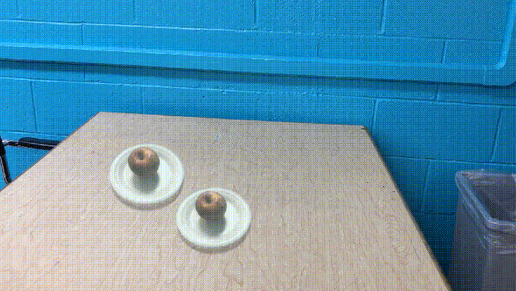
Before we actually recorded our first volumetric projection, we referred to this video in order to get an idea how to do it. Here is a gif of our test video:
Alyssa
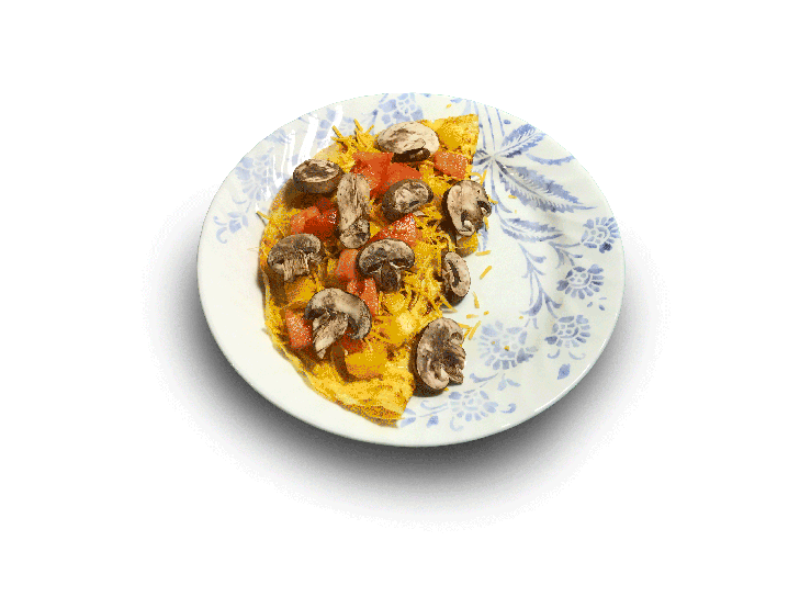
We met on Saturday morning to shoot some sample video footage, and we discussed creating the gifs for all the different omelettes. After shooting the videos, I went to the lab and worked on creating the Photoshop files. Below are 2 out of 4 finished gifs:
Erica
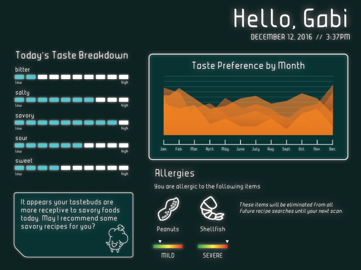
This would be the screen you would see after your tongue scan. It includes the following:
a greeting with the date and time
a breakdown of your taste preferences based on the scan of your tastebuds
a chart tracking your taste preferences and how they change each month
current allergy information
a prompt from Cheffrey based on your taste preferences
There’s some negative space that could still be utilized and some things that could be rearranged, but for now I think we are on the right track.
Gabi
This weekend I went in and added a little more detail to Sara’s designs and also added two more. This is what we have for now:
Megan
I was tasked with taking the interface screens from Erica, Sara, and Gabi as well as the gifs from Alyssa and animate everything in AfterEffects. I used the same technique and video reference as the apple projection I made previously this weekend (top of the blog post). For this, I animated both the volumetric plates and the tongue scan. In some areas it looks a little rough and am looking into ways to smooth it out to to make it seem more realistic.
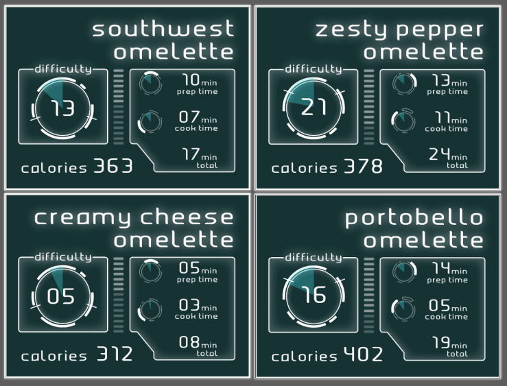
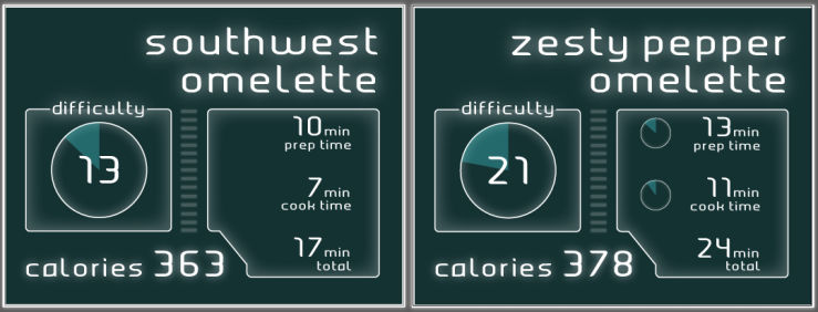
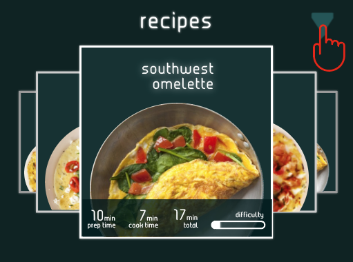
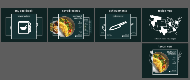
Recipe Selection
Tongue Scanner
Sara
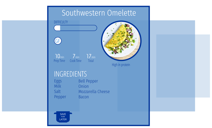
Since we redesigned most of our interface, I worked on the recipe information that would show up on the wall when the user is swiping through the various plate holograms. Although I think this information should be plain and simple, I tried to add some boxes and glows around different elements in order to make the design look more futuristic. Since we no longer needed the omelette image on this screen, there was more negative space to fill with “futuristic design elements.” (Easier said than done)
I still think there is a lot of negative space, even inside of the boxes, but I’m having trouble figuring out what to add so that the design doesn’t look so busy that it distracts from the basic information that it is displaying.
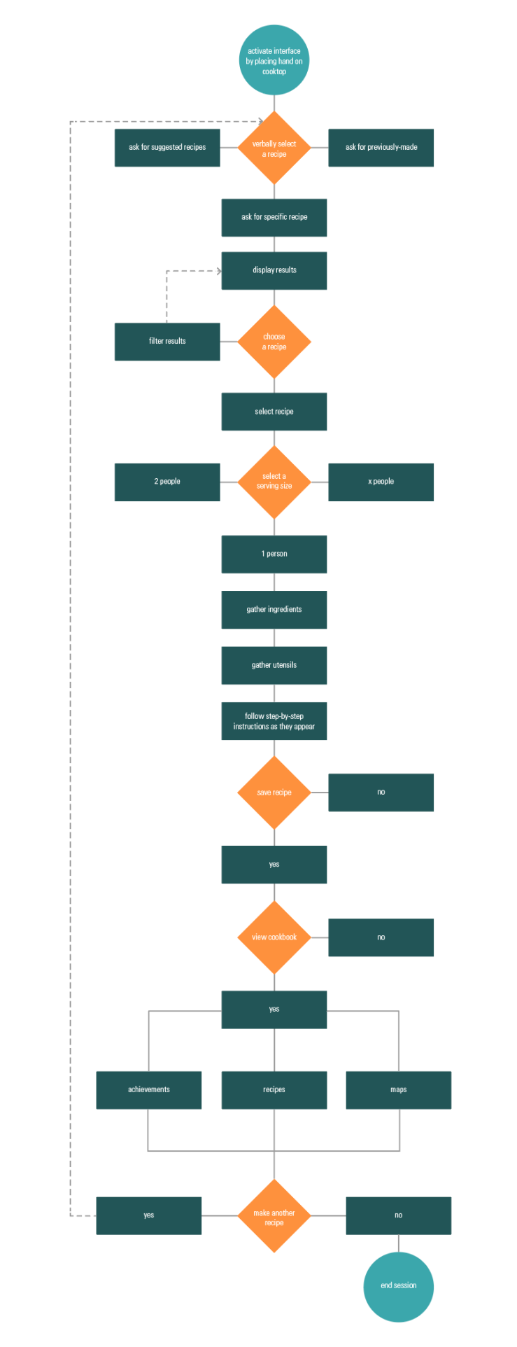
In class on Tuesday, we decided to rework our idea to make it more futuristic. We went to the middle room to create new ideations and brainstorm:
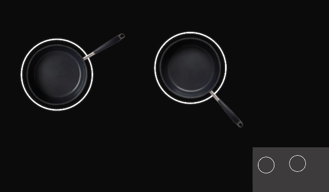
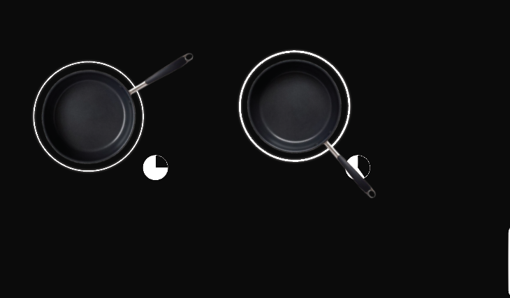
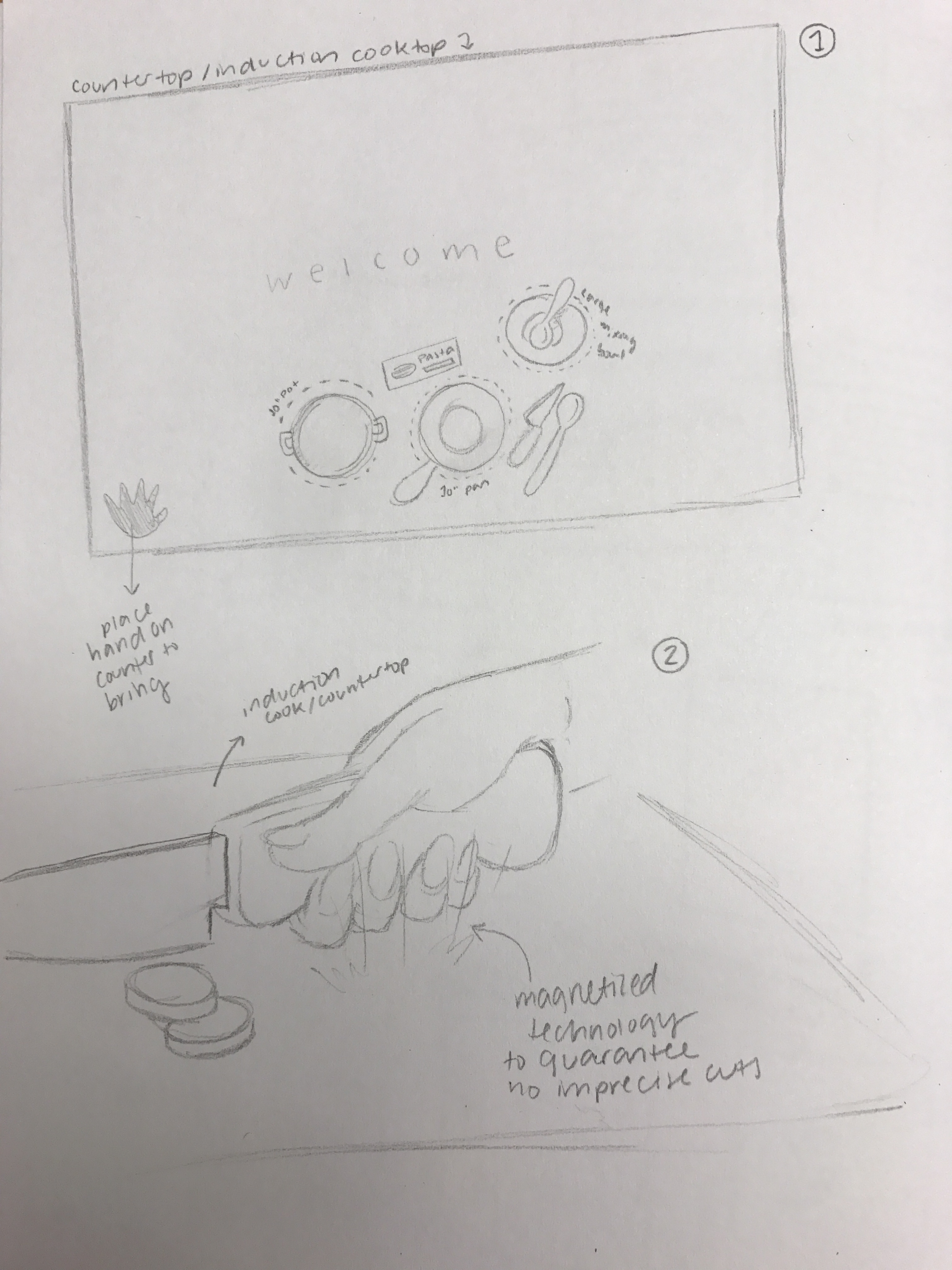
In the first image, you can see our new idea of how the recipes would be displayed. Having everything on-screen was making the design feel not futuristic enough and more like an app, so we decided to have volumetic projections of a plate of food on the cooktop so the user could swipe through a little more naturally and organically.
In the second image, we created kind of a walkthrough of using the interface.
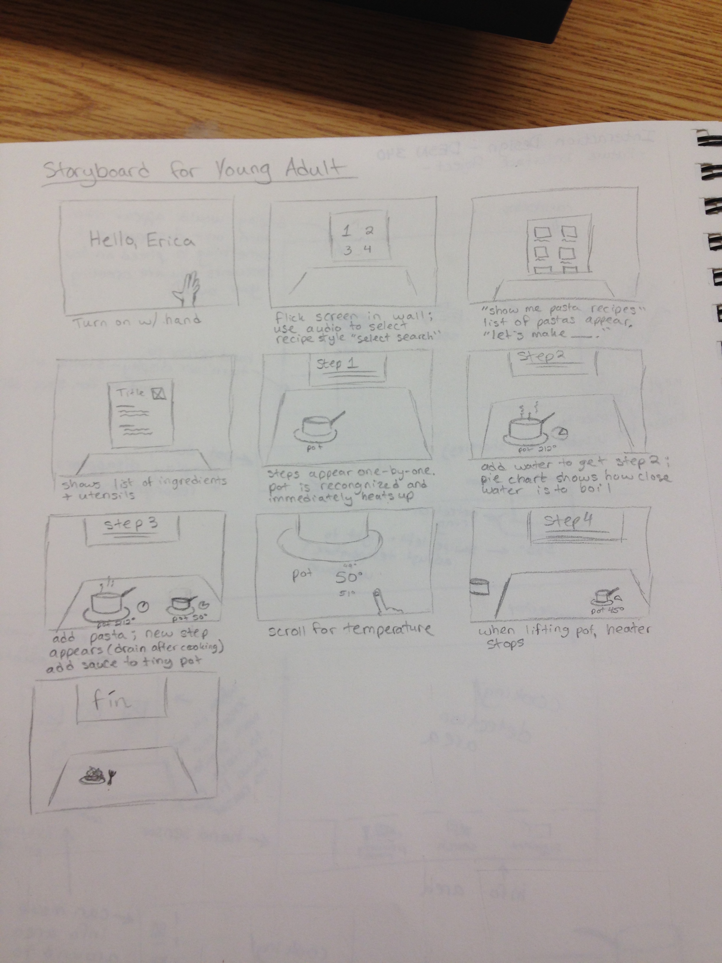
Step 1
You scan your tongue as a way of identification into the app
Your fridge, pantry, and any other place food is stored is scanned for any available food at this time as well
Once your tongue is scanned, an overview appears on screen that tells you about your tastebuds & descriptions of the 5 major taste groups, allergies, etc. After you’ve read this screen you can choose to enter the interface
Step 2
The welcome screen
This screen gives you the option to view suggested recipes based on available ingredients & your tastebuds, or you can search other recipes to make/save for later
“Based on your available ingredients and current taste bud scan, we’ve found these recipes for you.”
Step 3
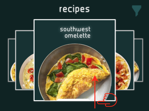
This screen describes the recipe selection screen
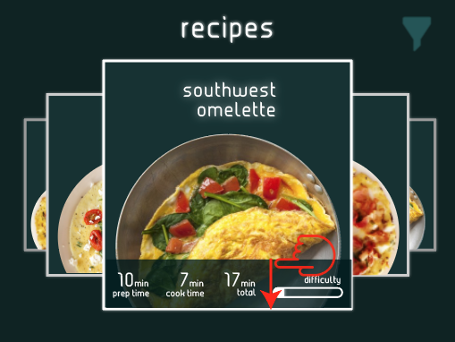
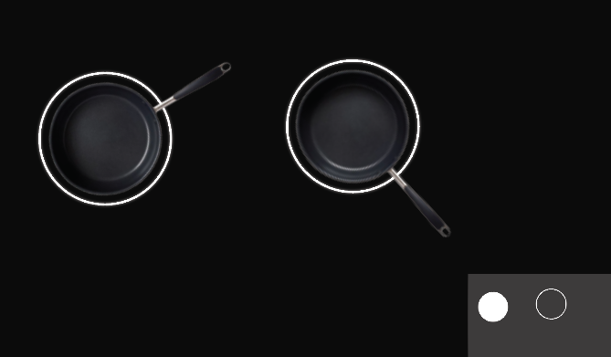
Each plate would be spinning on its own axis and the user would swipe through naturally. You would have the option to sort things by different categories, which would be voice-activated
The name of the recipe and a preview would be on the back screen, so users could get a preview of everything they’d need to make the recipe. As you swipe through the recipes, the preview would change to match whichever recipe was directly in front of the user
To select a recipe, you’d place the “plate” onto the cooktop, and the next screen would come up
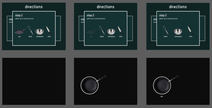
Step 4
This screen is the ingredient collection screen
A volumetric projection of each ingredient would appear on cooktop and disappear when the ingredient is placed down
There would also be a utensil collection screen after this screen is complete, we didn’t draw it though because it would be exactly the same as the ingredient selection screen
Cheffrey would read the ingredients and/or utensils aloud to you
Also the counter would identify each ingredient/utensil as it is placed onto the counter
Step 5
The instructions would be displayed on screen, one-by-one
Cheffrey would read them aloud to you, and you could ask the instructions be repeated if necessary
Some examples of techniques from the readings that we’d be using are:
Today we talked to Professor Pannafino about our progress so far. Below is the feedback we received:
Something based on specific ingredients
The visuals are working
Halfway there
Limited by the Mac OS style display
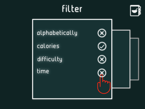
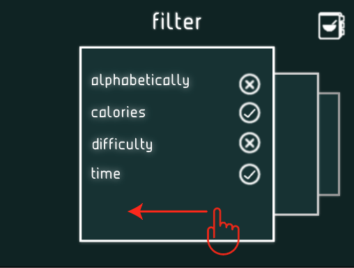
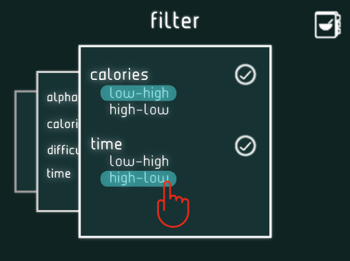
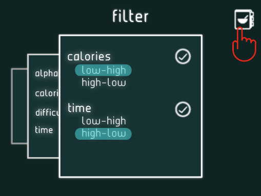
Could there be a “sort by” etc. option? Health, time, difficulty, etc.
Different shapes, different ideations
Think of Blue Apron sheets
Show all ingredients
Organization and structure is there, but try to have different ideations
Variation
Needs indication of temperature – not just low, medium, and high
Thermometer, more detail
Think about which colors mean what
Push some of the ideas of future design
Where do they use vocal commands, etc.
Be precise with the Cheffrey illustrations
Don’t be like Clippy – people didn’t really like Clippy
We went through and decided who is going to do revisions on which screens:
Alyssa
Heating screens (Gabi’s original files)
Erica
Cheffrey screens (Sara’s original files)
Gabi
Recipe screens (filtering, etc.) (Group original files)
Megan
My Cookbook screens (Alyssa’s original files)
Sara
Ingredients/utensils screens (Erica and Megan’s original files)
Alyssa
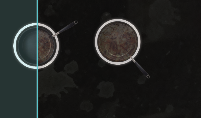
On Monday, I reformatted the cooktop screens that Gabi worked on. Below is a comparison of the 2:
I took the general ideas of Gabi’s and tried to combine them with some of the elements of the other screens. I also wanted to work on tongue scanning technology that would read tastebuds and dietary preferences and suggest recipes based on that, but unfortunately did not have a chance to work on it so I plan on working on it tomorrow night.
Erica
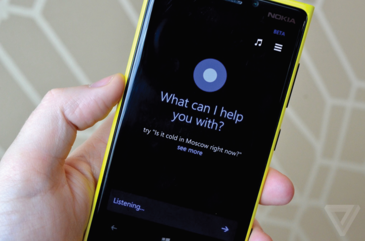
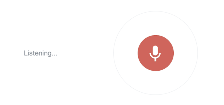
Tonight, I worked on refining the volumetric displays with Cheffrey. Before I began, I referenced current voice recognition technologies. The main three I referenced in my designs were Siri, Cortana, and Google Assistant. Below are pictures I used for inspiration:
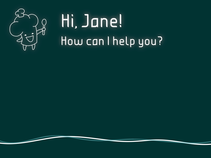
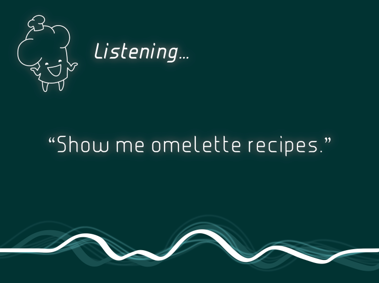
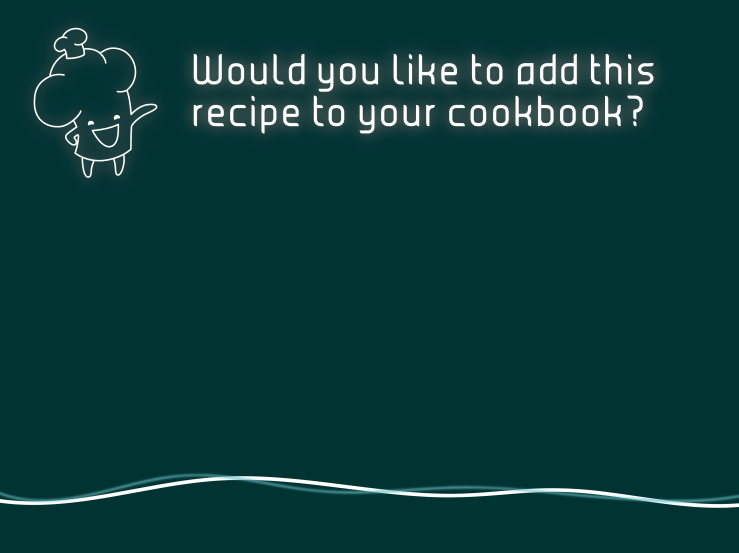
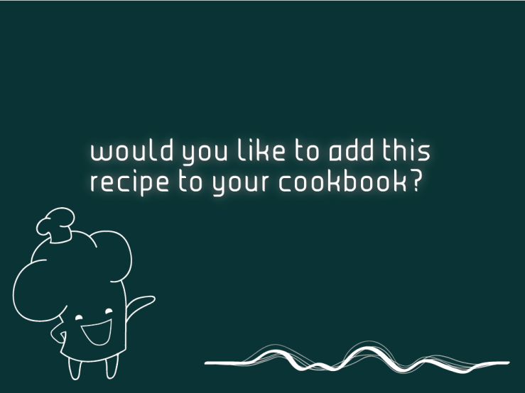
This is some inspiration I used for layering sound waves. There are different levels of sound such as the voice that is speaking directly to the interface and other background noises. I thought this would help to show that the interface recognizes these different levels but is smart enough to know which level to listen to.Here is a picture of Siri’s home screen. The screen displays a simple prompt which reads “What can I help you with?” and an inactive sound wave, showing that the interface is waiting for you to respond.Here is a picture of Cortana by Microsoft. Similar to Siri, Cortana also asks “What can I help you with?” with a prompt that gives the user a suggested question to ask.Finally, this is a portion of Google Assistant that displays the word “Listening…” as you are talking to it. I thought this was smart to show some sort of indication that the interface is actively listening to what you’re saying as you are speaking.This is the projection the user would see after he or she activates that interface by placing his or her hand on the countertop. The interface and Cheffrey, the assistant, greets you and asks if there is anything he can help you with.This design shows what the projection would look like as you are talking to it. Cheffrey changes slightly and the screen indicates that he is listening. Your words appear in quotes in the center of the screen and the sound waves also reinforce that the interface is being spoken to.This is a prompt you would see displayed at the end of your cooking session. What you are finished, Cheffrey asks if you would like to add the recipe to your cookbook and the sound waves are unmoving, waiting for the user to respond.
Gabi
Today in class, because we were told that our interface was not futuristic enough, I created the cooktop/pot cleaner. Below is what it would look like:
This cleaner would use laser-technology to clean even the toughest of grimes off of your cooktops, pots, pans, mixing bowls, and even utensils. As you can see, the cleaning laser is moving from left to right- cleaning the pans, and cooktop in its path.
Outside of class this week we were also asked to create some variation of what was done for this class. Below is a bit of a change from what Alyssa did before:
Megan
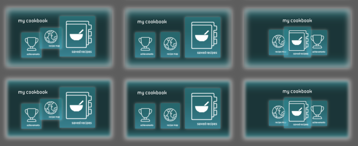
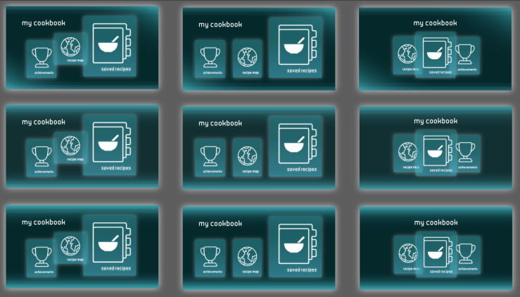
Before I began working on my variations of Alyssa’s “my cookbook” screens, I did some research both from the book and online. From both, I wanted to focus my variations more on style and layout to try to give more of a futuristic look while still keeping key layout features, like layers.
Above, the left image is the original screen Alyssa made and to the right is the image research I did. I pulled photos of vlumetric projects to understand how elements worked with each other and find commonalities. I also slightly adjusted the color palette. From the reading, there was a color swatch survey of the most prominent colors used in scify interfaces for each year. I took a screenshot of the colors and pulled one that I thought would work best. From there I did varying shades and tints to give a full palette (while adjusting the original as needed). The following are the screen variations I made.
For these first variations, I worked more with color. As you can see, each column is a different layout and each row has a different style. The style difference between the first and second row is in the elements inside of the outermost retangle. The first column is a different layout that incorporates overlapping layers, the second is a simple organized, and the third is similar to what we already had, but with the new style.For these, I tried the dark colors with a mix of lighter ones for more contrast. For the background I found a lot of futuristic interfaces have a “light source” type of look where either the bottom is the lightest or the top and bottom edges are. I tried to incorporate this in my variations. The difference between rows is the amount of Gaussian blur on the outermost edge. The columns are difference in layout.For these I completely removed the Gaussian blur but kept the glow in the background. The top row is the same as the previous image, but without the blur effect in the background. The bottom has some line work on the top and bottom to add to the “extra” elements the book talks a lot about.For the top and bottom rows, I increased the opacity on the background to 100% as opposed to the 85% I was using for everything else. The top row has the light-gradient in a different location while still keeping the line work. The second row is similar to the image before with adding the line work, but I also added glow to the lines to make it pop more. The third row is the same as the second however has 100% opacity in the background.Lastly, I took a photo we had of Gabi’s apartment with the countertop and wall and tried to one of the screens in context.
Sara
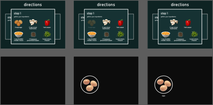
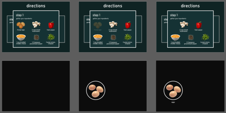
We were told to come up with a few more ideations for our UI designs, so we all switched screens and tried to design them slightly differently. I added the list of ingredients to the side, slightly changed how the counter reads the ingredients (eggs), and took out directions and step because I felt they might not be needed.
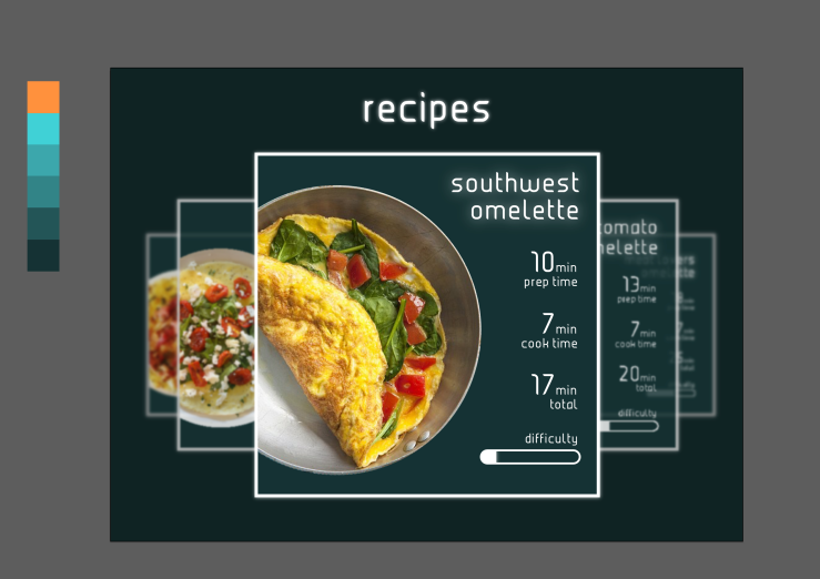
We started to take our sketches and render them on the computer and started with the recipe selection. We took Sara’s original design and combined her elements with Alyssa’s typography/color selection.
Agreeing that Sara’s design had too much information on it, we removed most of the elements but kept difficulty, and time so the user can see more than just the image and title of the recipe.
Sara’s first attemptAlyssa’s typography/colors
After looking at this, we decided to create the following:
Based on the readings, we decided to bring in elements they discussed: glowing, dark colors, and layering. We also went with strictly lowercase typography.
We then broke down who would make each screen over the weekend:
Alyssa
My cookbook (map, achievements, recipes)
Erica
Ingredient collection
Gabi
Countertop UI/pullout menu (heating/cooling on cooktop)
Megan
Utensil collection
Sara
Screens with Cheffrey on them (welcome screens, soundwave screens, etc.)
Alyssa
Screen Designs
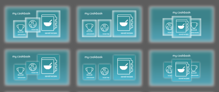
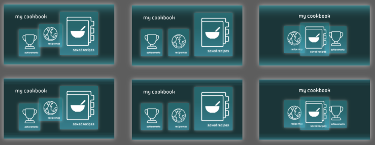
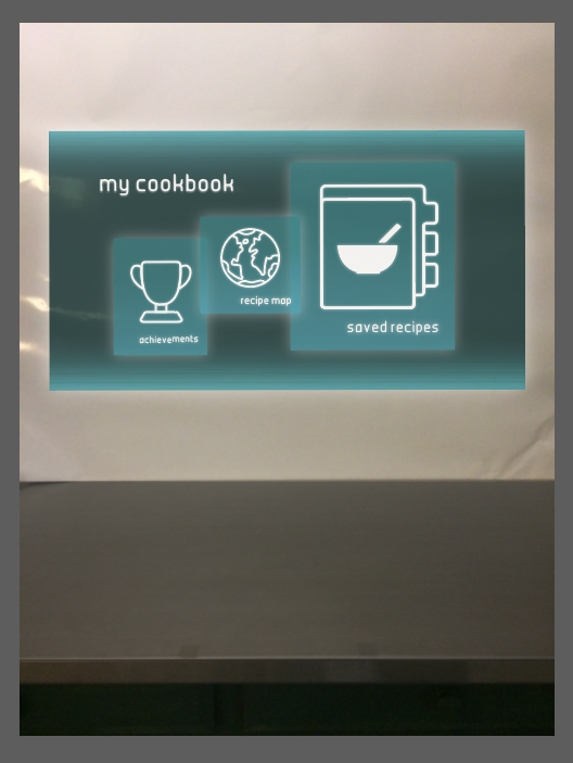
I worked on creating the “My Cookbook” menu. This consisted of screens for recipes the user has saved, achievements (aka skills the user has learned/mastered), and a recipe map of locations where the recipes a user has created originated from. I just touched on each of the screens, but I think from something like this, we get an idea of what each of these menus would look like.
Logo Sketching
During class on Wednesday, I was drawing on the chalkboard while we came up with ideas for our screens. As a group, we decided we really liked the phrase “What’s Cookin'” (because “What’s Crackin'” was too egg-specific). Based on this, I decided to play around with different perspectives and angles of the lettering of the phrase “what’s cookin'” for our interface’s title. Sara worked on the illustration for the logo, and we plan on putting the two together to create the finalized logo.
Erica
Refined Flowchart
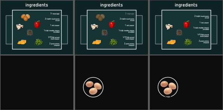
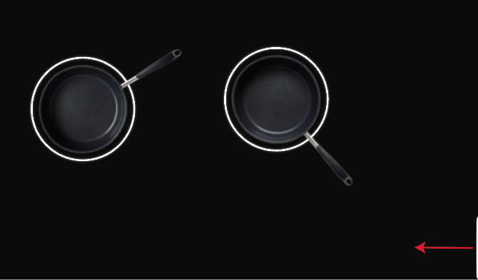
UI Design for Step 1: Gather Ingredients. The top artboards show the volumetric projections on the wall with pictures, names, and amounts of each ingredient needed. The bottom artboards show what the ingredients look like when placed on the countertop.
Gabi
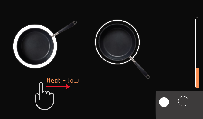
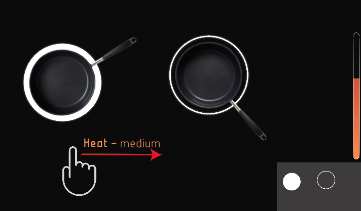
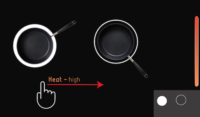
This week outside of class I focused on creating the slide-out menu that would appear on the cooktop that would allow you to change the temperature settings of each item you have placed on the cooktop. Below is what I have come up with:
The menu (bottom right) would only show up as a small white tab. The user would slide it out with their finger.This is what the menu would look like once it is slide out. Very simple.The user would then select the pot that they wish to edit. This is a nice safety feature- if the interface skipped this step and allowed the user to simpy glide their finger along the surface anytime to change the temperature it is almost a definite that they would end up changing it by accident at some point.Once the user has selected the pot or pan that they wish to change the temerature of, they simply need to glide their finger from left to right to turn the temperature up. It will tell them beside their finger if they are changing it to “low”, “medium”, or “high”. Just in case they wish to hit a level between “low” and “medium” or “medium” and “high”, a thermometer will show up on the right side when they are changing the temperature settings. It will disappear when they are done.The farther the user glides their finger, the hotter the cook top will become.
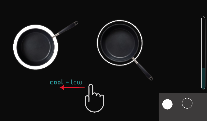
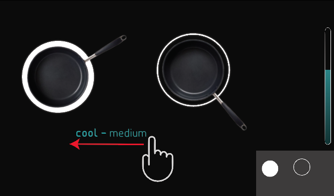
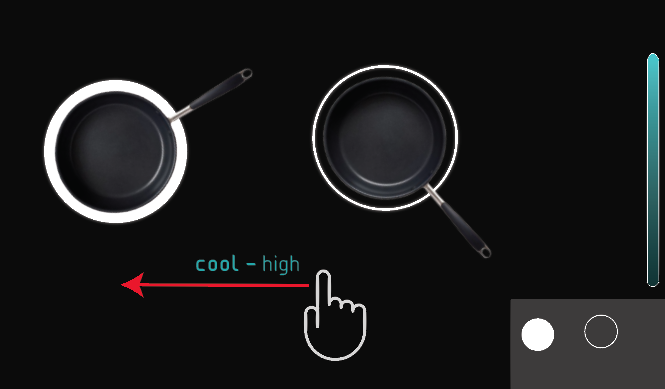
Along with the obvious heat settings, this cooktop also had cooling capabilities. All the user needs to do is select the item on the counter (using the pullout menu) that they wish to cool and drag their finger from right to left instead of frem left to right.Again, the farther they drag their finger, the cooler it will become. Also, the cooler the setting, the higher the thermometer goes.
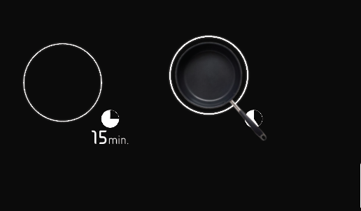
This cooktop will also measure how much time you still have left to cook/cool something. The timer will click away until the circe is hollow and your food is done.If the user wishes to find out how much time is left, they can simply tap the timer- and the time in minutes/hours/seconds will appear.
This week I was also asked to take pictures of the space that we will be filming. Below are some images of options:
Megan
Refined Storyboard
UI Design for Step 2: Gather Utensils. Top artboards are the volumetric projections on the wall and bottom artboards are what it would look like on the countertop.
Sara
I might want to un-center Cheffrey’s quotes and move them closer to the top-right of the screen. I also haven’t decided where to put the voice wave element that shows the user that his or her words are being heard by Cheffrey.
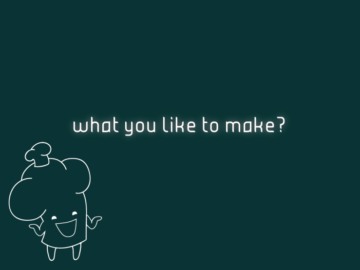
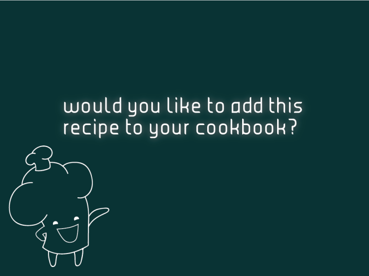
UI design for welcome screenUI design for starting promptUI design for adding to cookbook promptUI design for adding to cookbook with sound waves when the user speaks to Cheffrey
Today, Professor Pannafino was unable to make it to class, so we met during class time to discuss our ideas, refine our storyboarding, etc.
As requested, above are our meeting pictures showing that we met during class.
We spent most of class coming up with a more detailed look at what the interface will look like. We drew inspiration from the gestures used in Her, and from the Cover Flow list option that Apple provides in its OSX interface.
Her gestural interface & volumetric projections in video game
Cover Flow list on OSX
Based on this, we did the following interface sketches:
We went through the process of making an omelette. Our interface will be mostly gesture-based with elements of audio integration as well.
Over the weekend, we made a plan to get major screen design done. We also divvied up some smaller tasks between the 5 of us:
Flow chart refinement: Erica
Storyboard refinement: Megan
Final context photography: Gabi
Logo/name design: Alyssa (lettering) and Sara (illustration)
In class on Monday, we got some feedback about our project idea. Afterwards, we decided to narrow down the exact features we’d like our interface to have, and worked on storyboarding, usability diagrams, and doing a green screen test.
Feedback
Make sure the contaminant detection also covers the counter top and not just floor
Like the idea of having the instructions up (ex. on a wall in front of countertop) instead of on the surface
Make hand activation to turn on and also recognize your personal profile
Magnetic knife cool idea – very useful and effective
Maybe add a “self-cleaning” feature
“Cool” feature to allow the user to cool things quickly
On Tuesday night, we all five met up and worked on the filming for the green screen test. Here is the video:
Here is the storyboard and usability diagram from the child’s perspective:
Here is the storyboard and usability diagram from the young adult’s perspective:
Here is a photo to prove we were all together (we couldn’t get all of us in the picture so Sara offered to take it):
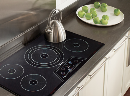
Gabi: “Induction cooking heats a cooking vessel by magnetic induction, instead of by thermal conduction from a flame, or an electrical heating element. … For nearly all models of induction cooktops, a cooking vessel must be made of, or contain, a ferromagnetic metal such as cast iron or some stainless steels.” Some of the advantages of induction cooking include instant heat (water boils much quicker), it will only heat the cookware and not the whole stovetop (much more efficient), safe for children (when you lift a pot the burner automatically shuts off and even if you touch it seconds after you will not burn yourself), food cannot get cooked on to the surface because the surface does not get hot (easy to clean), it also looks very nice and clean. Some bad parts about it, though, include the fact that they are expensive. Also, you don’t actually necessarily need to re-buy all of your pans, you just have to make sure a magnet will magnetize to the bottom of them. If it will, then those pots and pans will work on the induction. Also, you won’t be able to cook if the power is out.
Alyssa: During research, I also found that induction cooktops are much more energy efficient. According to this blog post, induction cooktops are “84% efficient at energy transfer, vs. 74% for a smooth top electric unit,” meaning the heat efficiency is similar to that of a gas cooktop. The blog post also states that induction cooktops are “90% efficient with power use, using 2.8 kW to deliver 2.52 kW” (for comparison: electric coils are 55% efficient and use 2.0 kW to deliver 1.1 kW; gas is 50% efficient and uses 3.5 kW to generate 1.75 kW). I also found that induction cooktops generate a lot less waste. Users will not have to turn on a vent fan or open a window like users with electric/gas stoves will, because there will not be as much excess heat.
Megan: Since the prompt our project is based off of is to encourage lifelong learning, it is important to understand what the proven benefits are to learning how to cook. In terms of social status, people who can cook are seen as being more stable than those who are not. They can also give homemade gifts which are seen as more personal and thoughtful. For personal gains, learning/knowing how to cook can increase your self-esteem and make you feel more valuable. There is a sense of independence and self-sufficiency that goes along with it. Also, it allows you to grow relationships with those around you if you’re cooking with someone else. The basic skills that can be reinforced from cooking are following directions, reading, math, and responsibility (for example, handling knifes). This is particularly easier to teach in children since they are still learning and growing. In general, learning how to cook with improve your health and lifestyle. This study shows that people who cook most of their meals eat less calories per day than those who frequently eat out. Not only that but they also eat less eating out due to not regularly overeating. Lastly in terms of finances, cooking your own food saves money. In this study, it has been proven that the cost of food prepared at home dropped by 0.5% whereas the price of eating out increased by 2.7%. Even though the slight drop in food prices helped the restaurant too, they are taking into account the labor that goes into making the food, thus increasing the price. (Benefit sources: Source 1 & Source 2).
Erica: I did some research on both the benefits of cooking and information on induction cooking, so some of my research may overlap with everyone else’s. As far as benefits of cooking, here are the main points I found:
Source of pride and self-sufficiency
Develop a more open mind towards different tastes and cultures
Builds confidence
Learn about nutrition
Brings people of all ages closer together
“You will get to know your children, and they you, more deeply when you cook with them…you will share recipes, techniques and anecdotes that you learned at the elbows of mothers, grandmothers and great-grandmothers long gone.”
I also found other skills people can learn by cooking:
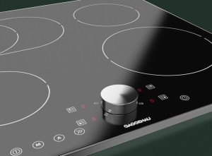
For my research on induction cooktops, I first spoke to my dad because he does a lot of appliance installations. He recommended that I look into Gaggenau and Thermador induction cooktops because they are the best on the market right now. Tons of other brands, including Bosch, Wolf, and Miele, sell induction cooktops but I stuck to researching those two for the time being.
This review compared Wolf and Gaggenau cooktops and noted that “Wolfhas touchpad controls where the Gaggenau unit has a magnetic knob that controls the setting. This knob can be taken off the cooktop and placed in a drawer for a clean sleek look.”
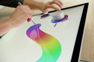
This reminded my of Windows’ Surface Book Dial that we saw in class. I thought this was an interesting feature with the potential benefit of being not only more sleek, but also more sanitary.
Gaggenau Induction Cooktop Microsoft Surface Book
Ideas (based on research)
Gabi: could sell magnetic pads on side to stick to bottom of any pot so they work on induction (hypothetically), also- using part of the main area as a mixing area would make sense- the touch pad would know that it isn’t meant to heat the mixing bowl because it might not be magnetic (something to that effect).
Alyssa: I really like all of Gabi’s ideas based on the research, and I think the idea of the magnetic pads for the pots is a really good idea. Related to Gabi’s idea about the cooktop being able to sense what kind of pot is on the surface, this reminded me a lot of the tabletop touch screens and pen technology at the Cooper Hewitt museum in New York, and the Connected Worlds interactive installation at the 2016 Maker Faire. If you look at the links, Cooper Hewitt has these pens that touch a specific mark on the wall to access information, and the Connected Worlds installation has these “logs” that create paths for the “water” in the installation to follow. The water on the screens of the installation isn’t affected by people standing in the way of the path, yet when the logs are placed in different areas of the screen, the paths change. We could look more into this kind of technology for what Gabi mentions above – some kind of sensor in the stovetop would recognize when something is a pan and does need to be heated, vs. when something is a mixing bowl (or if the user is leaning on the counter, placed something on the counter, etc.) and should not be heated up. I think Connected Worlds is a really great example to look at as well because it is completely gesture-based, and we could look into some of the gestures and movements the users make if we consider creating some kind of “screen” interaction.
Megan: Thinking of how this would start (and basing off of Alyssa’s and Gabi’s ideas), there could be a hand-size sensor on one of the corners of the induction surface you just simply need to swipe in any way to turn the system on so it is more gestured based. If you’re looking for a recipe to try, the countertop could show suggested foods based on what you have made before, a search feature, or previously made recipes. If you don’t want to do any recipes, you could simply place down a pot/pan/bowl and the countertop will sense you are making something on your own. If you remove everything, it will bring back the recipe display.
Erica: To incorporate more of the lifelong learning aspect, perhaps there could be a “performance review” at the end of your cooking session to review what new skills you’ve learned and track your “progress” (maybe you used a few new ingredients that week or became more proficient in cutting, etc.) I was also thinking that you could set goals and input your age before each cooking session to tailor your session to specific goals and skills you want to improve (for example, you might want less of a focus on technical skills for young kids and more advanced skills for young adults).
Worksheet
We also worked on the Determining Project Focus worksheet from class on Monday:
What is the problem?
People want to learn how to cook
People want to improve their cooking
What is the context and interaction (user, place, position)?
User: anyone who wants to learn to cook
Place: kitchen
Position: countertop, standing
What are the types of information presented (audio, written, visual content)?
This interface would incorporate audio and visual cues for users
What info does the user need: some kind of sensor on their pots and pans, and/or stovetop
What sequence do we see things: we’d see information depending on what is on the countertop
How are you going to use hide and reveal: we will hide any information that doesn’t relate to what is on the countertop, and reveal things that are relevant when appropriate
What are the possible future technologies?
Some kind of tastebud scanner technology
A scanner technology that would tell users when raw meat residue is left on countertops
Some kind of technology to help users with cutting techniques
Induction cooktop technologies
Sketches
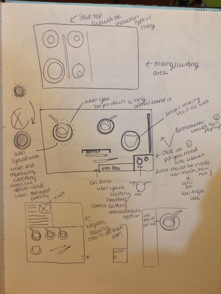
This week outside of class we were asked to do some idea sketches for our futuristic learning for life cooking interface. Here were some of our ideas:
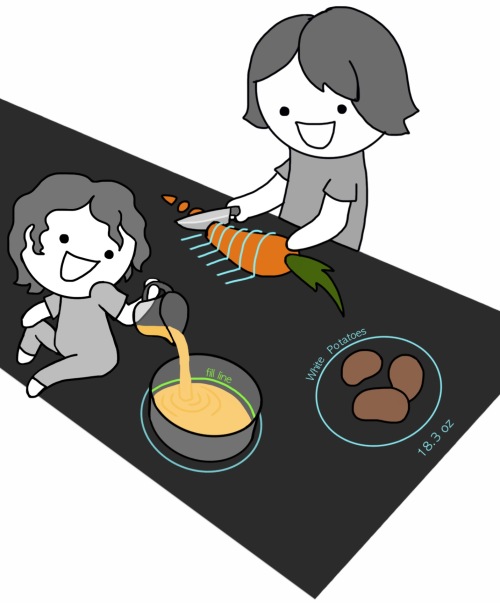
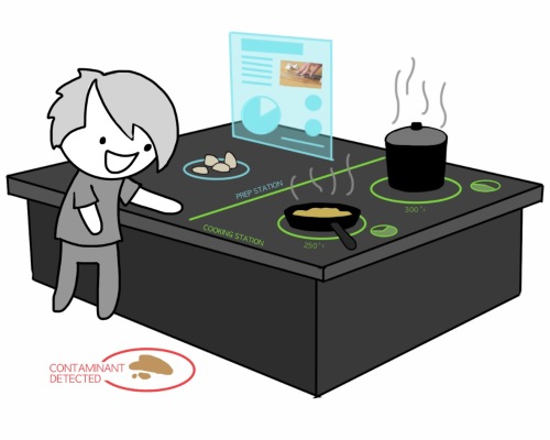
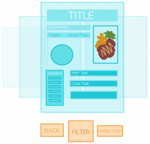
Laser guide that lays on top of food to show you where to cut it (light blue lines on the carrot). A laser fill line in pots to show you how high to fill it. Ingredients placed on counter are highlighted it shows you what it is (white potatoes) and how much it weighs (18.3 oz)Contaminant detector (it’s on the floor but if we’re just doing a board on the counter then it would only detect contaminants on the counter.) Each station (cooking, prep, etc) could be color coded. The surface also tells you the temperature that something is cooking and has a little circle next to each pan/pot to show you how close it is to being done cooking. Hologram with current instructions on itHologram where you can select a recipe by swiping through “pages”and each page has a recipe with basic info on it (ingredients, dietary restrictions, prep/cook times, etc.)
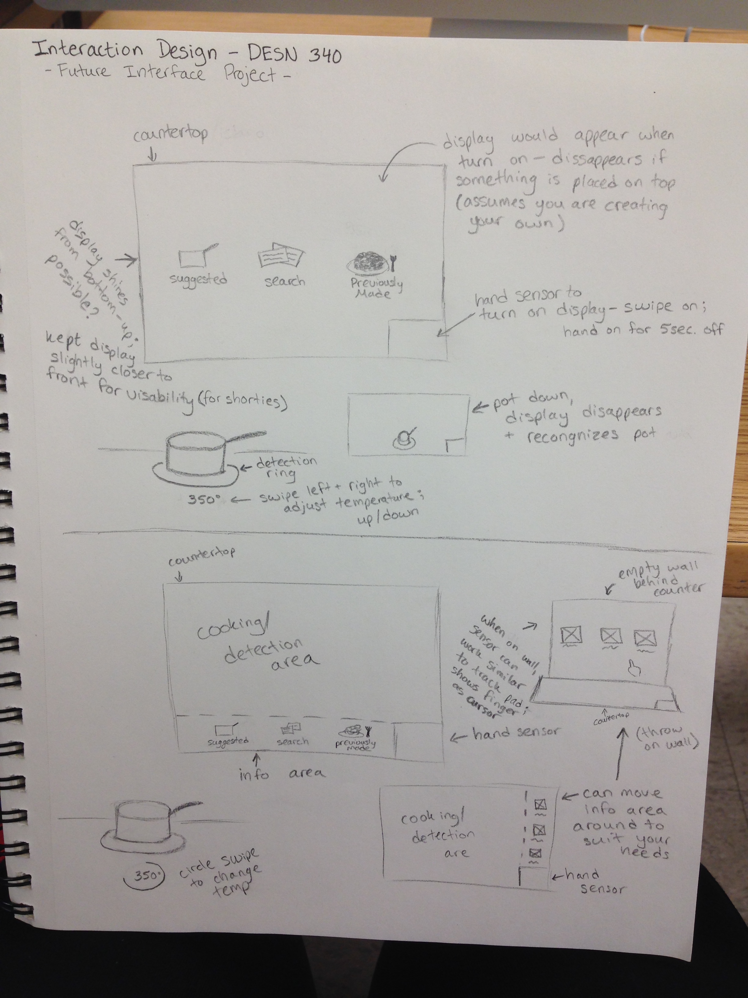
1. In my first sketch, I wanted to show that I think it would be interesting if the cooktop was turned on by some kind of touch-sensor (think Windows 8 computers and how they had that photo-touch password screen instead of a typed password). I also thought that when you turned the cooktop on, that some kind of sensor would appear and recognize/identify everything that was on the counter. 2. In my second sketch, I remembered seeing on everyone’s research that the induction cooktops use magnetized technology to heat pots, so I figured maybe some kind of magnetized technology could also be used to help users cut properly (think like how magnets with the same poles facing each other will push away)
Today in class we presented our ideas to the class (as seen in the last post). Some of the suggestions that we received were to create a smart surface instead of using a bunch of chips and such. We were also told that it might be cool to make use of the backsplash and that flat space- maybe the directions are there. Another idea that we were given was to have a hologram over the island – coming down from maybe a hanging pot rack. And the last idea that we were offered was to maybe use the ideas of using various stations- a cooking station, mixing station, cutting station, etc.
After receiving this feedback, we agreed with getting rid of the chips inside of the pot. We discussed making a clear acrylic sheet that would go on top of the counter that would heat your pots, turn into a cutting station (cut safe), we like induction, so it would not be hot to the touch and might also be self sanitizing. We also discussed having the watch be self sanitizing. Below are some images that we were influenced by: